What’s New
Health Status Revamp
We’ve introduced a major update to the Health Status system across the platform, delivering improved accuracy, consistency, andvisual clarity. These enhancements are designed to help users better assess equipment condition and performance at a glance.
Improved Health Status Algorithm
The new algorithm provides a more comprehensive evaluation by combining fault amplitude trends, notification patterns, and condition intelligence. This results in a more accurate and reliable representation of overall equipment health.
Updated Labels and Colors
We’ve standardized the Health Status naming convention and color scheme across the platform:
- Acceptable, Reportable, Unsatisfactory, Unacceptable are the primary status labels.
- Learning and No Data are now visually represented with black circles for clarity.
- The previously used “Anomaly Detection Only” status has been removed.
Interface and Visual Enhancements
- Dropdown Menus: In dropdowns for selecting plants, equipment, or components, Learning and No Data statuses now show as black circles for consistency.
- Table Views: All health status tables now display both the circle and label, left-aligned for improved readability. Hover effect shave been removed from the status icons.
- Enterprise Metrics:
- Health summary cards no longer display colored gauges around the Health Score.
- Filter buttons in Enterprise Health Metrics now use a consistent primary orange color, replacing the previous yellow and red variants.
Historical Data Handling
- Health status history in equipment/component logs now uses the new labels for recent records.
- Historical records retain their original labels for accurate context.
Supporting Updates
- All informational tooltips and help texts (accessed via the “i” icons) have been updated to reflect the new system.
- Health status updates now apply consistently across the platform UI, notifications (email/SMS), and integrations.
API Updates
- While the original health status data remains unchanged for compatibility, the updated health status labels are now providedvia new keys in our API responses.
- healthStatusV2: shows the current health label.
- systemStatusV2: reflects the data transmission status from sensors or sources.
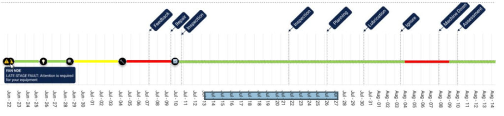
Health Status Color Overlay in Equipment Timelines
We’ve added health status color overlays to the Equipment Timelines to provide clearer visual context for equipment and component conditions over time.
- Timeline Logic:
- The equipment timeline displays the health status of the entire equipment.
- The component timeline displays the health status of the individual component.
- Color Indicators:
- Standard health status colors are applied across the timeline for quick visual reference.
- Black is shown when health status is not assigned (i.e., No Data or Learning).
- Legend & Guidance:
- A new info icon/legend has been added to explain the meaning of each color in the timeline, helping users interpret the data quickly and confidently.
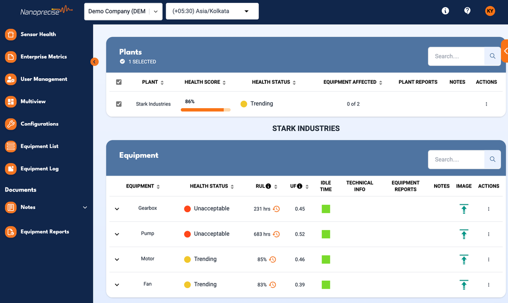
Health Statuses in Equipment Log
We’ve enhanced the Equipment Log to incorporate Health Status indicators directly into the log interface for improved visibility and sorting.
- Health Status Circles: Each equipment and component card in the log now includes a health status circle, using the same color scheme applied across the platform.
- Improved Sorting Logic: The default sort order has been updated to:
- Acknowledged status
- Health Status (worst on top)
- Timestamp: The previous priority-based sorting has been fully replaced by health status ranking.
- Active vs. Inactive Events:
- Active events remain tied to current notifications being generated.
- Inactive events will no longer display health status circles on the cards. Instead:
- The notification count is replaced with the feedback recorded at event closure.
- This feedback is also displayed under the equipment name when a log entry is selected, along with the label: Inactive: Repair Recorded.
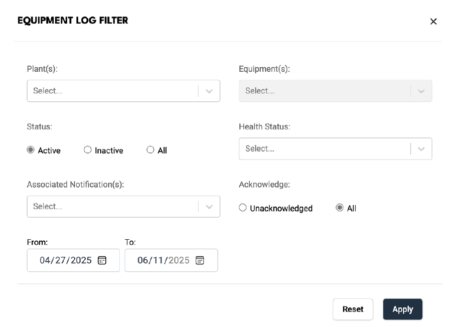
- Filtering Updates:
- The Priority filter has been removed from the Equipment Log.
- The Health Status and Acknowledged filters have been moved up in the filter list for easier access.
Enterprise Metrics Enhancements
We’ve made several visual and functional improvements across Enterprise Metrics charts and downloads:
- Charts & Visuals:
- Updated average line color and extended it across full chart width.
- Downtime Savings by Equipment Type now calculates average using only valid (non-null) data.
- Improved chart padding and spacing for clarity.
- Chart with multiple savings types now displays slight separation between detail lines.
- Chart title updated to include “Type” for Last Downtime × Equipment.
- Downloads:
- Company names now display as custom names (not IDs).
- Data is rounded to two decimal places.
- Cell A1 removed from all chart downloads (except SAVINGS_SUMMARY).
- General Updates:
- Charts show empty (not “No Data”) when data is zero/unavailable.
- Button label in Config updated from “Hide Cost Savings” to “Cost Savings”.
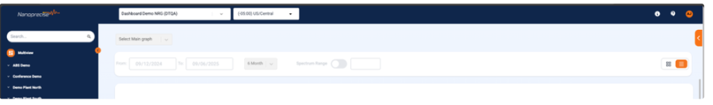
Company/Organisation Selector and Time zone Selector Reallocation
The Company/Organization selector and the Timezone dropdown have been relocated to the header at the top of the page. This enhancement has been done for all pages and is part of our ongoing effort to make navigation seamless and intuitive for all users.
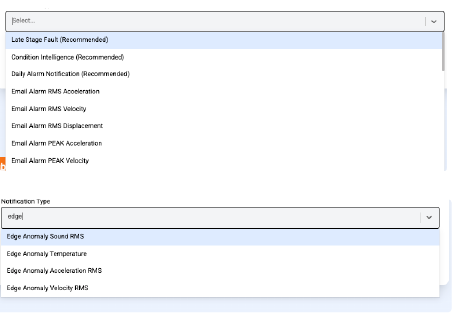
Notification Order & Naming Update
We’ve updated the order of notifications and standardized the naming conventions for Edge notifications to enhance clarity and user experience.
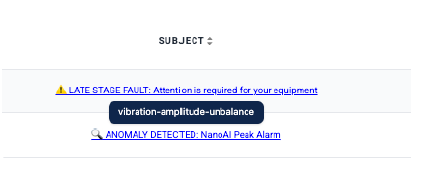
Notification Hover Graph Preview
Users can now view graph information related to a notification directly from the subject line. Simply hover over the notification subject line, and a quick preview of the corresponding graph will be displayed.
Connectivity Graph Update
We have removed the RSRP and RSRQ smooth curves from the connectivity graphs.
This Change simplifies the graphs and provides a clearer view of the raw data and also improve readability and reduce visual clutter.

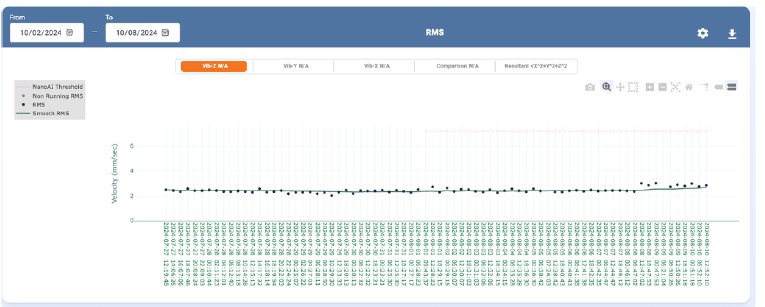
Chart Threshold Line Update
The threshold update line on all relevant charts has been removed. This has been done to declutter the visual presentation of the charts and to focus on core data trends without distraction.
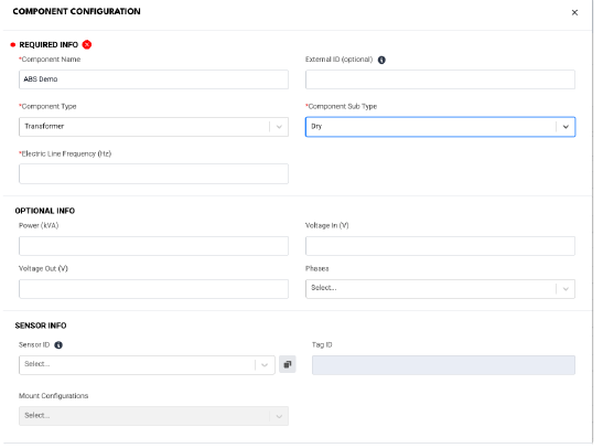
Support for New Component Type: Transformer
We’ve added support for a new component type: Transformer.
- Users can now add and configure Transformers as a component type under the equipment type: Transformer.
- Plant
- Machine (if Machine Table is enabled)
- Equipment
- This update enhances flexibility by enabling users to manage more component types within the platform.