The story of a small shift in perspective that solved a big problem.
“Every machine tells a story. The challenge isn’t collecting the signals; it’s seeing them together before the plot twist becomes a failure.”
Abhinandan Jain, Sr. Product Manager, Nanoprecise.

What We Learned from the Field
During a series of research conversations with plant teams across industries, a consistent insight kept surfacing, not as a complaint, but as a quiet obstacle everyone was working around:
“We have the data. But we can’t always see it together.”
Technicians weren’t just trying to analyze a single vibration spike. Reliability engineers weren’t just interested in confirming one motor’s condition. What they wanted was a way to compare, across equipments, across parameters, across time.
We heard:
- “I want to see what’s happening across multiple pumps at once.”
- “If I’m tracking vibration, I want sound, temperature, and humidity right there with it.”
- “I don’t want to guess which graph to trust, I want to correlate the shift.”
These conversations didn’t just inform the Multiview Dashboard, they defined it.
What Is Multiview, Really?
Multiview isn’t a visual upgrade. It’s an operational one. It gives teams the ability to configure up to four charts in a single view. What goes into each chart is entirely up to the user:
- You can choose to compare one equipment across four different parameters (e.g. vibration, sound, temperature, humidity).
- Or, select four equipments, all visualizing the same or different parameter(s) (e.g. RMS vibration) to understand cross-asset behavior.
The dashboard respects how analysts actually think: sometimes you need vertical depth (multi-parameter, one equipment), and other times, lateral comparison (same parameter, multiple equipments).
With just a few clicks, you can:
- Select parameter type: Vibration, Amplitude, Sound, Flux, Temperature, Humidity, Speed, Connectivity.
- Pick sub-parameters: RMS, Peak, Kurtosis, Spectrum, Envelope, Time Waveform, etc.
- Choose your unit: Velocity (mm/s or in/s), Displacement (μm or mils), Acceleration (g)
- Filter by state: exclude Non-Running data for cleaner insight
- Enable smoothed overlays to extract slow trends from noisy data
As shown in the dashboard, users can switch between Vib-Z, Vib-Y, and Vib-X with configurable thresholds, or compare humidity and temperature across critical points.
From Seeing More to Understanding Faster
The value of Multiview isn’t in the number of graphs. It’s in how it matches the way people solve problems.
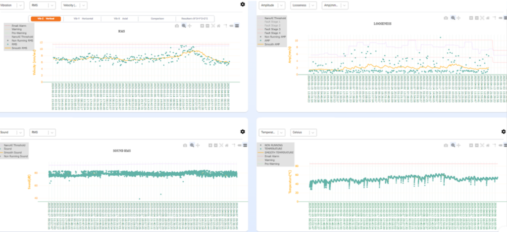
Scenario 1: Diagnosing degradation across one machine
It starts with an alert on a Compressor. A spike in amplitude data suggests possible misalignment. Naturally, you want to confirm. Is this just misalignment, or could something else be contributing? With the Multiview Dashboard, you’re not just viewing a chart, you’re running an investigation. In a single page, you bring up four key parameters for the same machine:
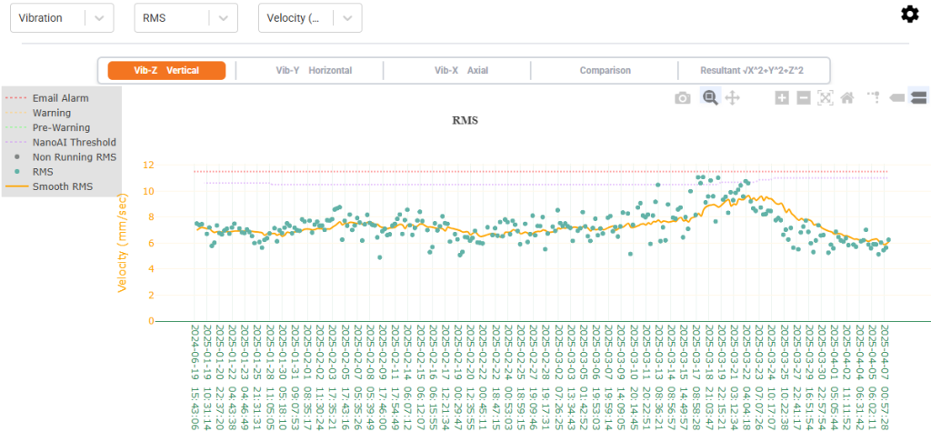
Chart 1: Vibration RMS
Flat and stable — ruling out imbalance or looseness at first glance.
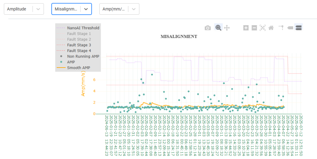
Chart 2: Amplitude -Misalignment
Clear upward trends. It’s consistent with early fault stages for misalignment.
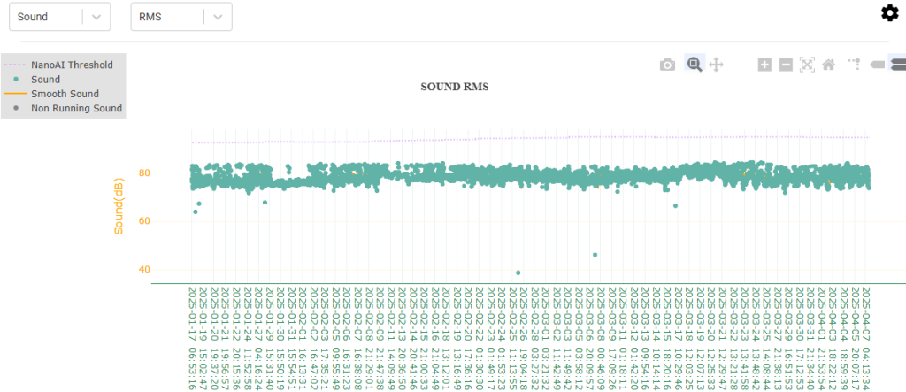
Chart 3: Sound RMS
Normal across the board. No indication of abnormal mechanical friction or cavitation
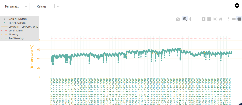
Chart 4: Temperature
Within safe operating limits. Process conditions appear steady.
At this point, you’re confident misalignment is an issue. But Multiview doesn’t stop at confirmation, it invites curiosity. So you dig deeper. You open another view for Amplitude – Looseness, and that’s when the bigger picture reveals itself. While the RMS values didn’t trigger alarms, the Amplitude for Looseness shows gradual increases and crossing thresholds, particularly in fault stage bands. Now you know: misalignment wasn’t the full story, it was a symptom. The root cause? A developing looseness issue.
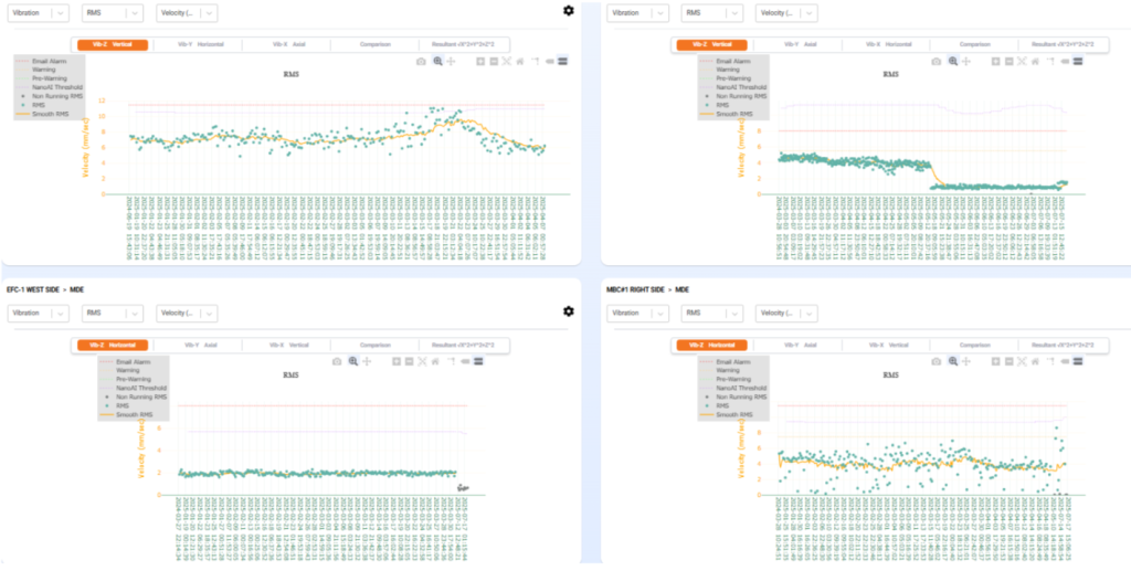
Scenario 2: Comparing multiple assets for system-wide issues
One of the conveyors, had shown a noticeable downward trend in vibration RMS values a few weeks back. At first glance, that might seem like a good thing. Less vibration, right? But anyone in reliability knows that a sudden drop isn’t always a good sign.
That particular trend turned out to be a result of a maintenance intervention. The team had acted fast, realigned components, checked looseness, and ensured everything was put back together properly. Now the real question was: Did the fix hold? And how does this unit compare to the others?
That’s where Multiview came in.
Instead of flipping through reports or toggling between screens, the team pulled up a Multiview panel showing four conveyors side by side:
Scenario 3: Validating resolution across parameters
After maintenance work is done, you can open the same Multiview you used for diagnosis and verify stability across all affected parameters. No toggling required. You’ve now made insight reproducible.
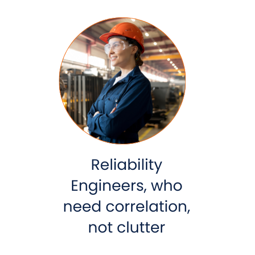
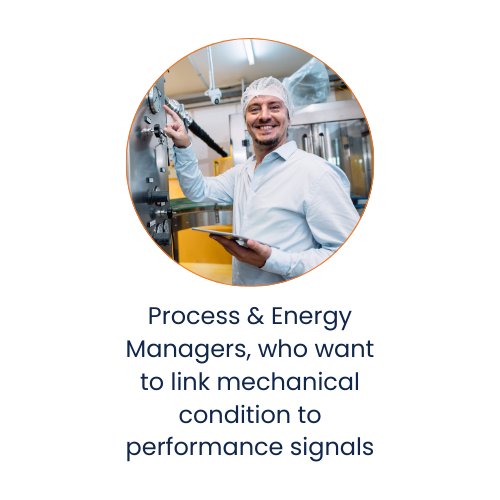
Designed for Engineers, Not Just Analysts
This isn’t just a dashboard, it’s a field-ready tool built for:

It bridges what used to be multiple screens, tools, and interpretations into a single decision-making frame.
And it does it without assuming the user wants complexity, just clarity.
The Ecosystem Around It and Why This Matters Now
This Multiview fits into a larger diagnostic ecosystem. It helps people observe and interpret.
Behind the scenes, Nanoprecise’s Condition Intelligence (CI) engine continually analyzes all collected parameters, looking for patterns that might be missed, surfacing correlations that indicate early failure modes, and helping filter out false positives.
Multiview is what brings those parameters to life. CI is what helps teams act on them confidently.
In today’s world it’s unacceptable to miss early-stage anomalies because they appeared on different charts. With energy prices high, labor thin, and equipment complexity rising, teams need perspective with data.
Multiview solves one of the most practical gaps in condition monitoring today:
- It reduces time-to-insight.
- It eliminates fragmentation.
- It gives teams the visibility to act before it’s too late.
And in a world where failure costs are measured in downtime, emissions, and reputational risk, speed and clarity are everything.
Final Thought: A View That Thinks the Way You Do
WWhen we built Multiview, we weren’t aiming to add more graphs. We were solving for the question we kept hearing:
“Why can’t I just see this together?”
Now you can.
And once you do, you’ll never want to go back to guessing.
About the Author
Abhinandan Jain is a Senior Software Product Manager at Nanoprecise, where he leads the development of user-centric platforms that transform raw sensor data into actionable insights for industrial maintenance teams.
With over a decade of experience spanning mobile, web, and AI-based enterprise platforms, Abhinandan has built and launched products across sectors, from edtech to gaming to predictive analytics. At Nanoprecise, he has been instrumental in launching the new Multiview Dashboard and driving the evolution of condition monitoring tools that bring clarity to complexity.
His product journey has been grounded in simplifying the complex, bridging technical depth with intuitive user experiences. He brings a hands-on, systems-oriented lens to product development in the world of predictive maintenance and digital reliability.